Typography · Print · 2023
Translations
A typography booklet tracing the parallel design processes of Carol Twombly and Ryoko Nishizuka, two women who translated the past into the present.
Typography · Print · 2023
A typography booklet tracing the parallel design processes of Carol Twombly and Ryoko Nishizuka, two women who translated the past into the present.
Role
Solo designer
Context
Typography 1 · 2023
Deliverables
Printed Booklet · MP4
Tools
Adobe InDesign · Illustrator
The project
The assignment was to choose two typefaces and compare and contrast them in a booklet. I chose Carol Twombly's Trajan and Ryoko Nishizuka's Higumin — two prominent women in type who, working decades apart and in completely different traditions, arrived at the same method: tracing historical calligraphy by hand and digitizing it into a typeface.
Twombly drew from Roman inscriptions carved into Trajan's Column in 113 AD; Nishizuka drew from newspaper prints of the Edo period in Japan. As the solo designer, I owned the whole project — concept, research, layout, typesetting, and the animated version — and used it to make one argument: that both designers were really doing the same thing, translating the past so it could be used in the present.
The booklet
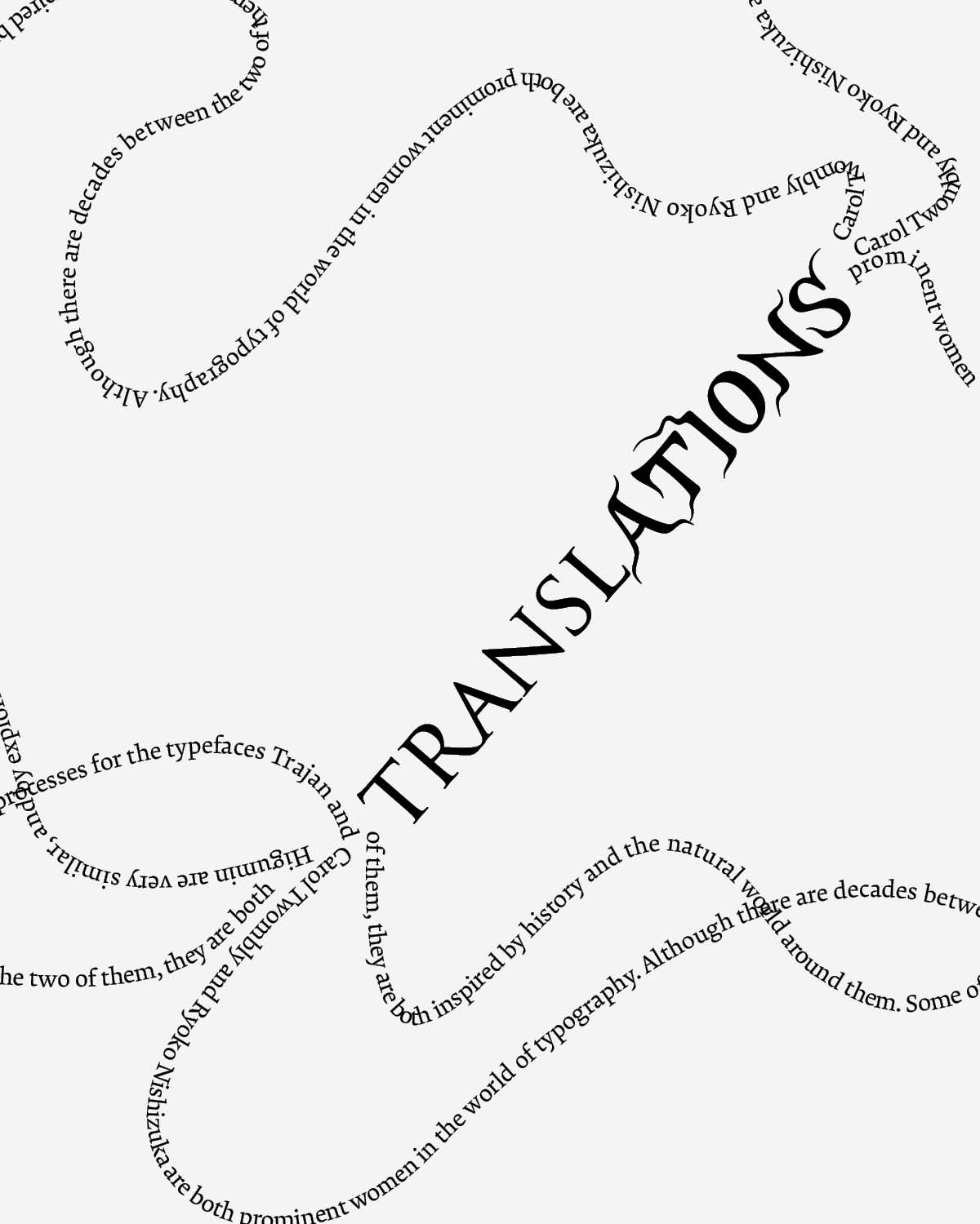
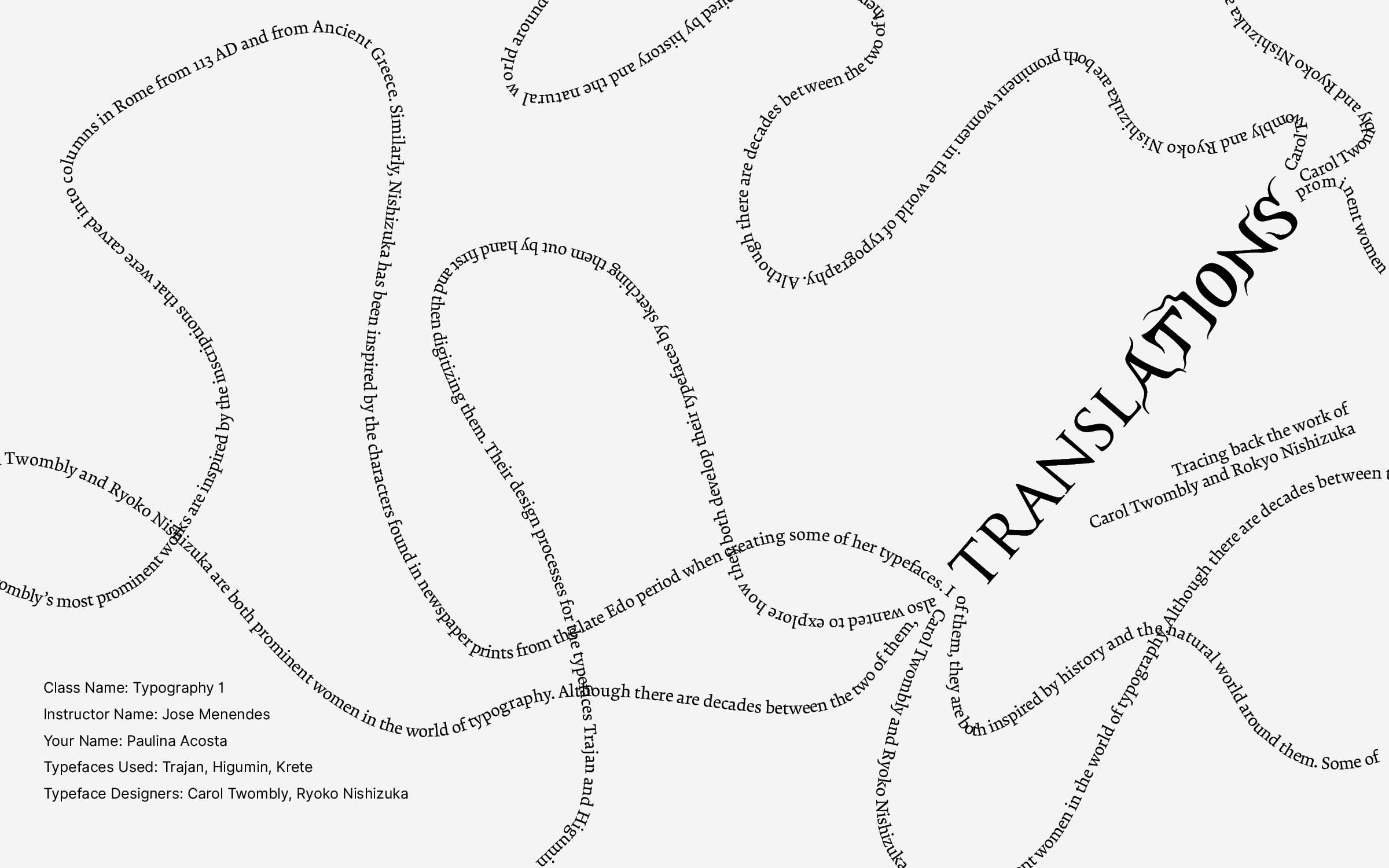
I set the cover in curving, custom-path text because I wanted the form itself to carry the argument. Trajan and Higumin come from different cultures, time periods, and languages, so the lines curve away from each other — parallel processes — but they bend back and meet, because both typefaces ultimately do the same thing: translate the past into type that reads in English today. The table of contents then introduces the five chapters through vertical image strips, each a visual teaser for what follows.
Inside the booklet
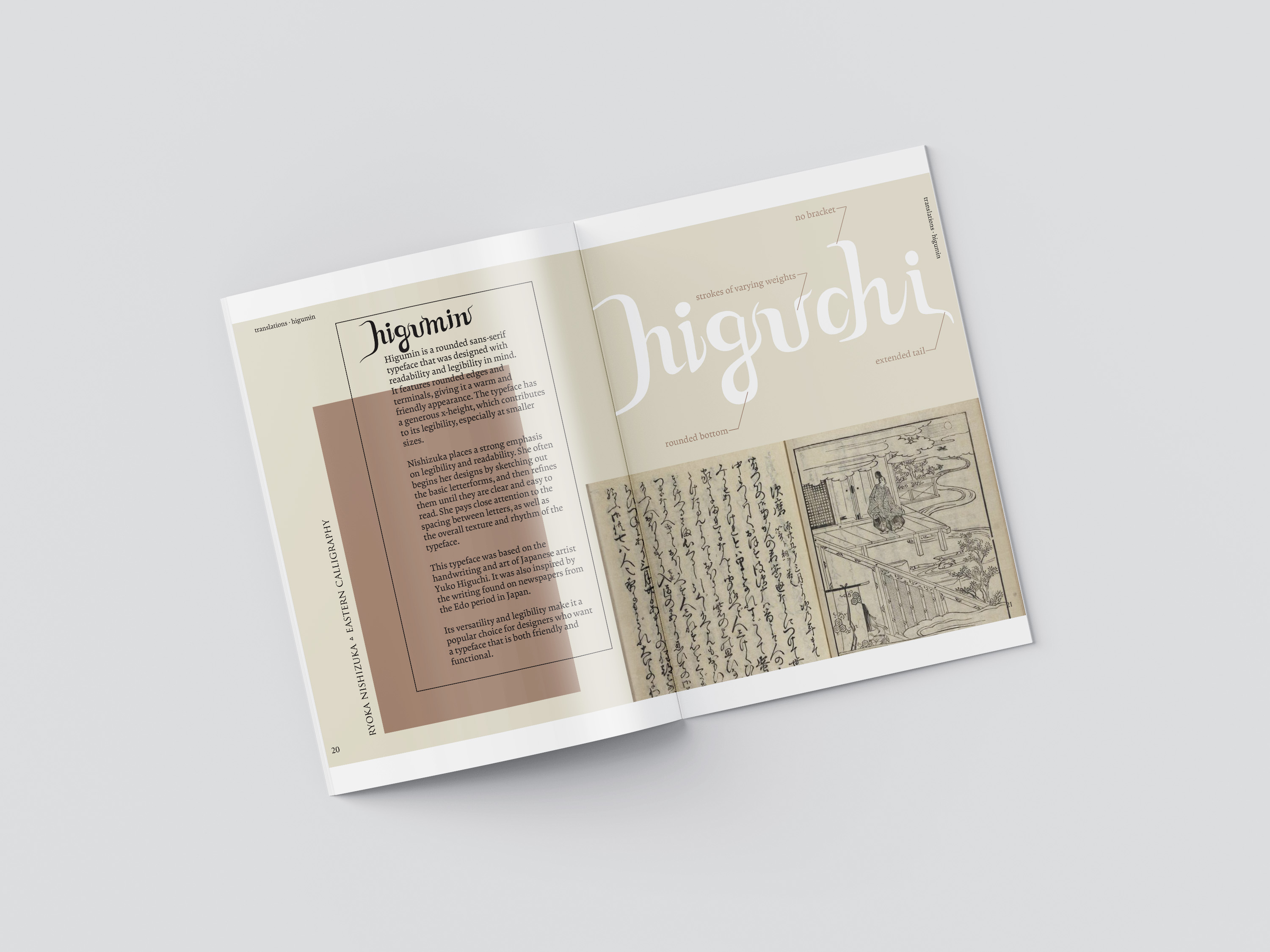
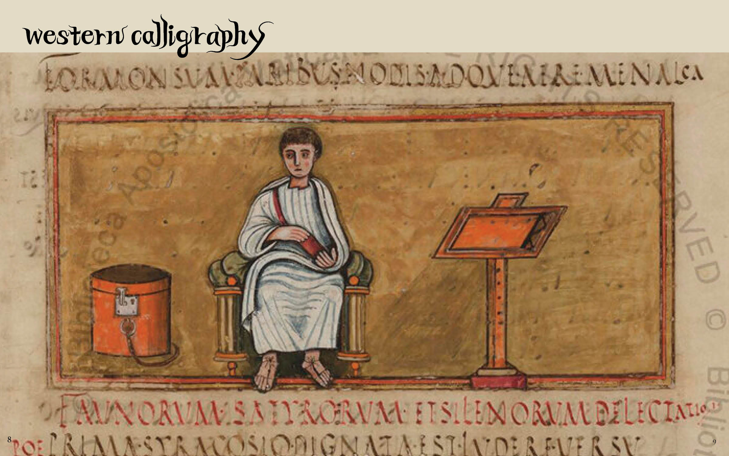
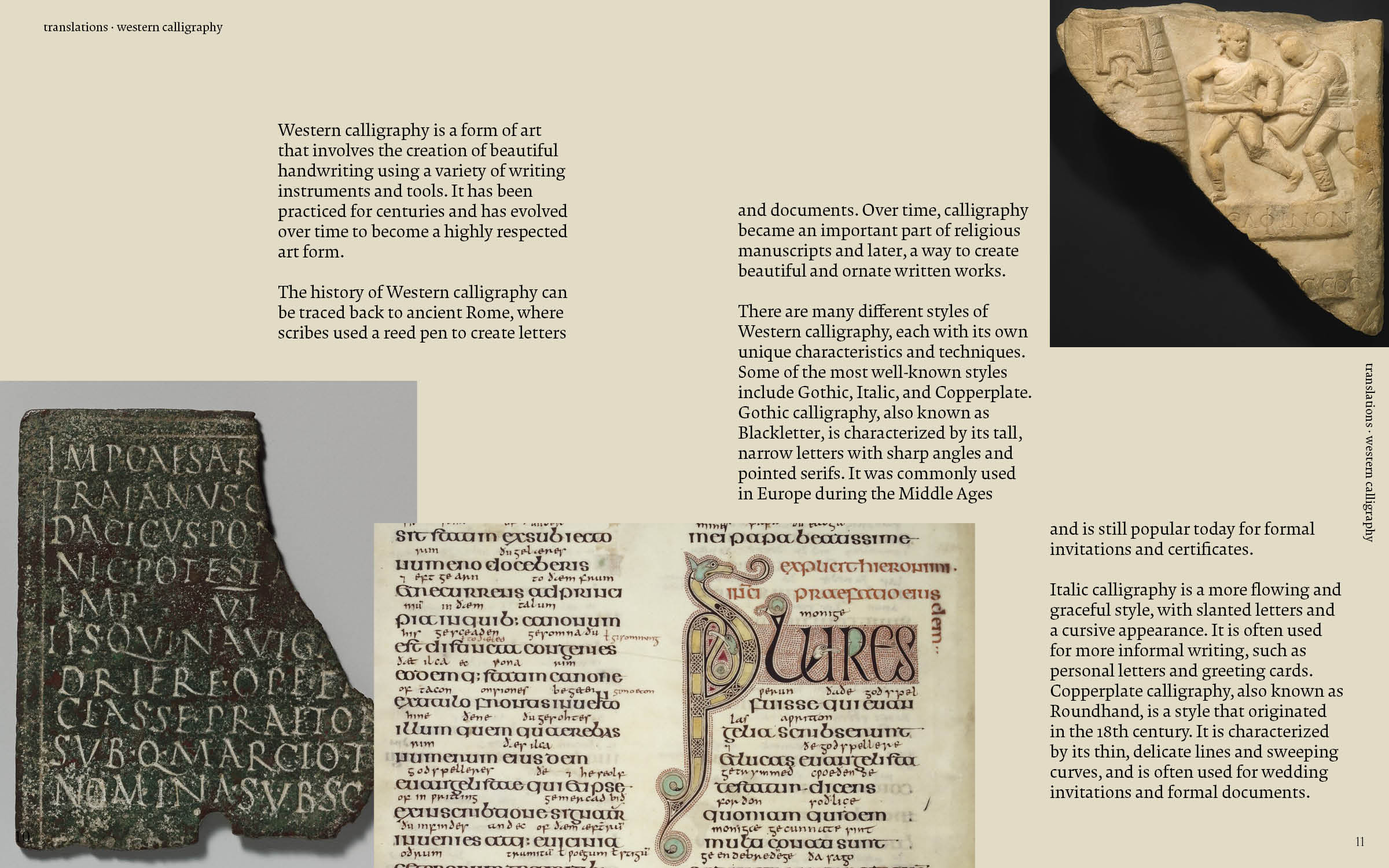
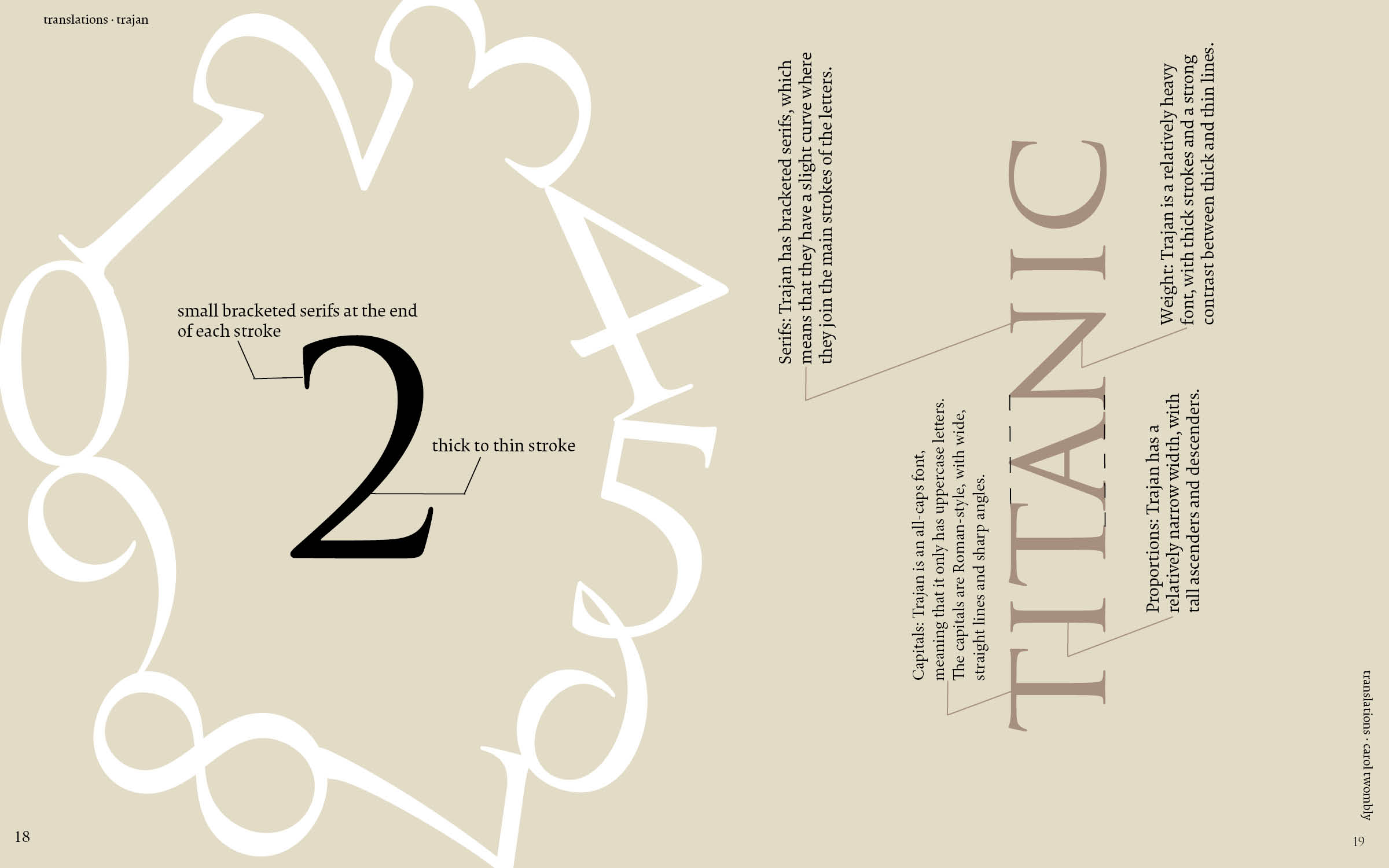
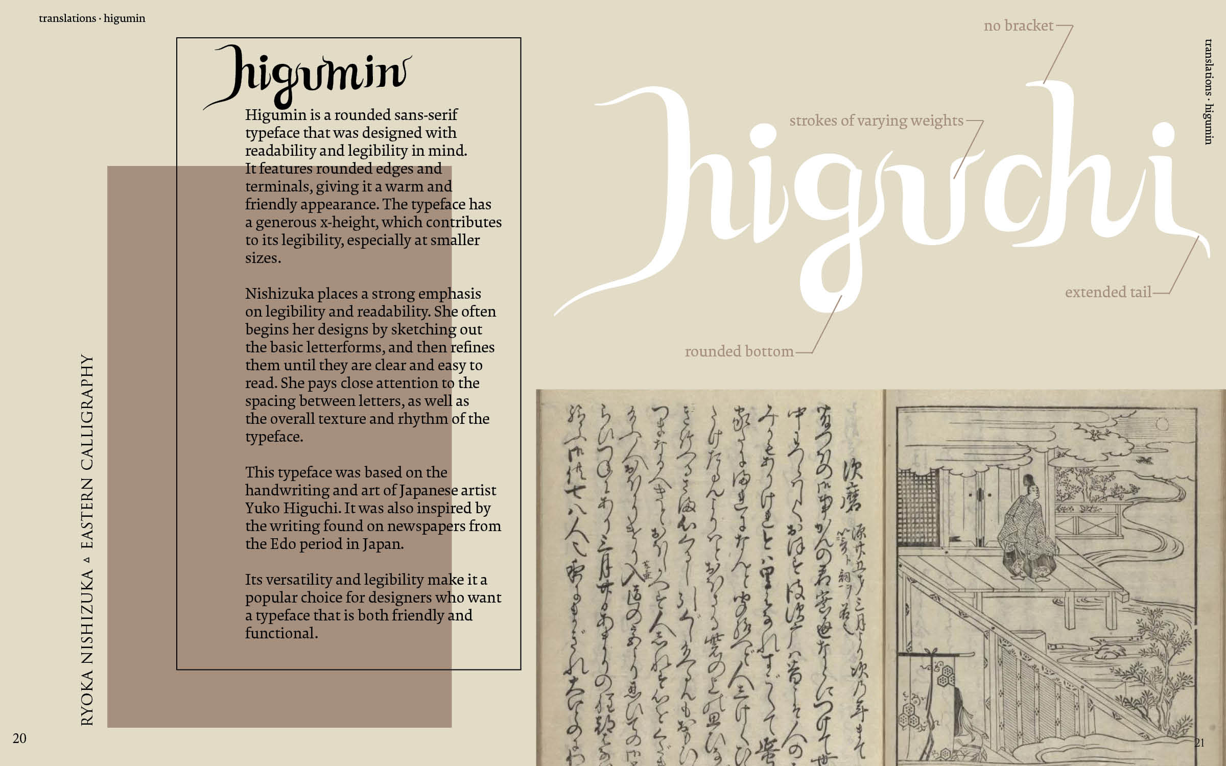
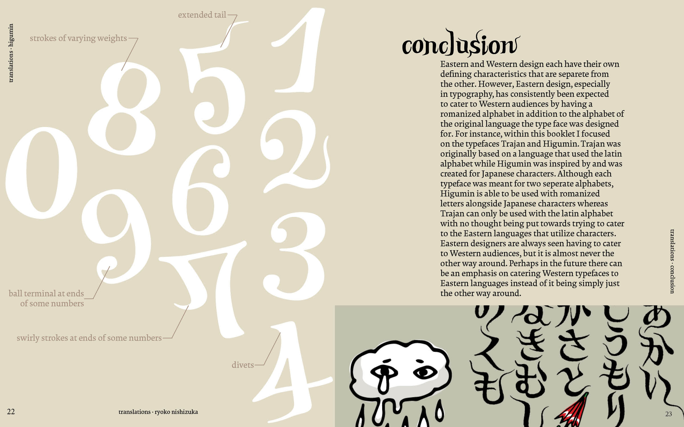
I set each chapter in the typeface it discusses so the reader could see the typeface in use, not just read about it. The Trajan chapter is set in Trajan and Krete; the Higumin chapter pairs Higumin with Latin characters. Even though each typeface's history is rooted in a different culture, it stays readable and usable in English while still carrying the small nuances of the tradition it came from. I paired every chapter with examples of the source material each designer drew from, so the lineage from carving or print to letterform stays visible on the page.
Read the booklet
Browse the complete booklet below.
Outcome
This was one of my first design projects in school, so I was learning as I went — playing with paths, layouts, and typesetting until the booklet matched the vision I had for it. In critique, my professor and classmates responded most to the curving, moving text: they felt it genuinely captured the art of translating from one culture to another. They also pointed to how the booklet was laid out and how clearly it represented each typeface.