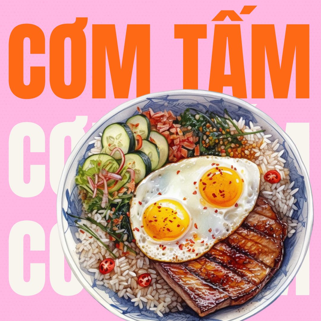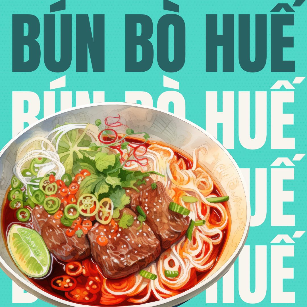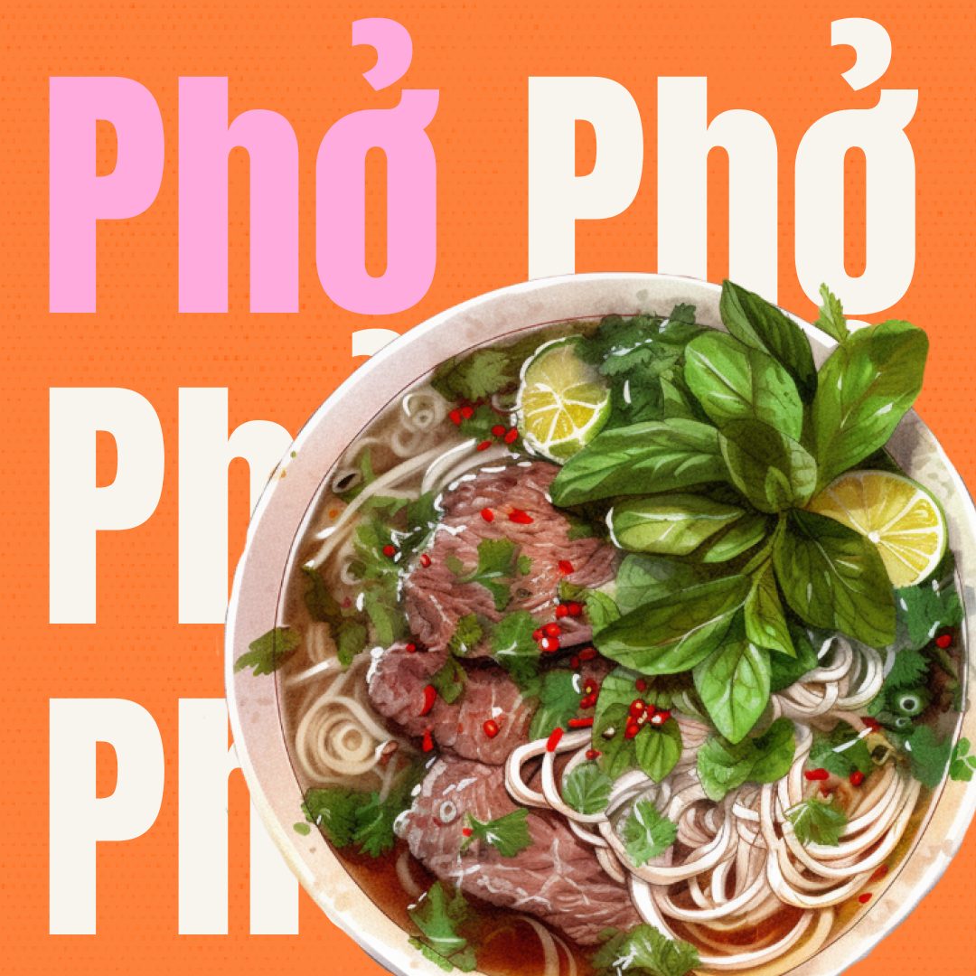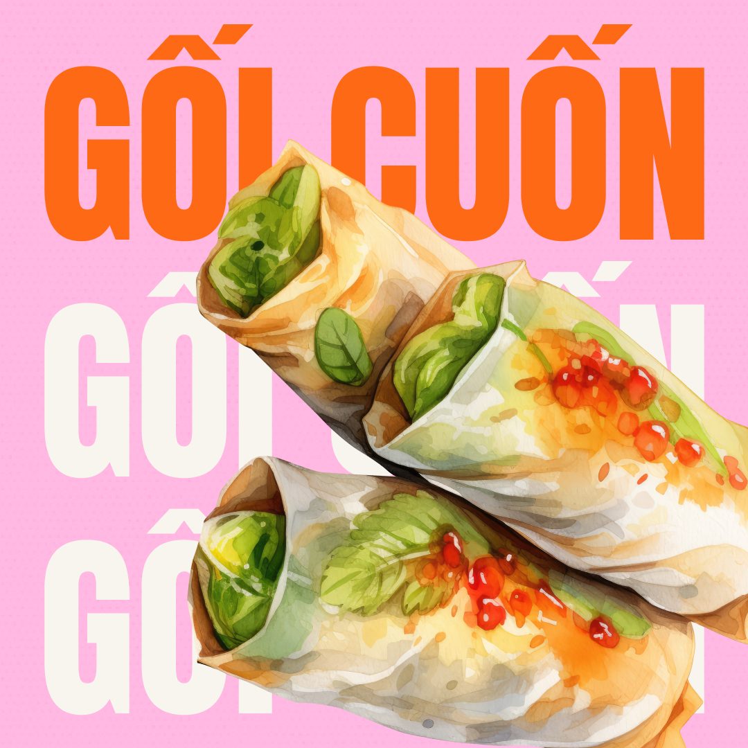
Brand identity · Print · Social · Signage · 2024
A complete bilingual brand system for a Vietnamese-American restaurant opening: logo, menus, posters, TV displays, social content, and collateral, all built from scratch for opening day.
Role
Freelance designer
(2-person team)
Client
B&N Sandwiches
Holland, MI
Deliverables
Logo, menus, posters, social, TV displays, business cards, signage
Tools
Adobe Illustrator · Photoshop · InDesign · Figma
The project
B&N Sandwiches is a Vietnamese-American restaurant and café in Holland, Michigan serving bánh mì, phở, summer rolls, boba, and Vietnamese coffee. When a friend's family was opening the restaurant, they needed a full brand system ready for their soft opening on June 14, 2024, and everything had to work in both English and Vietnamese.
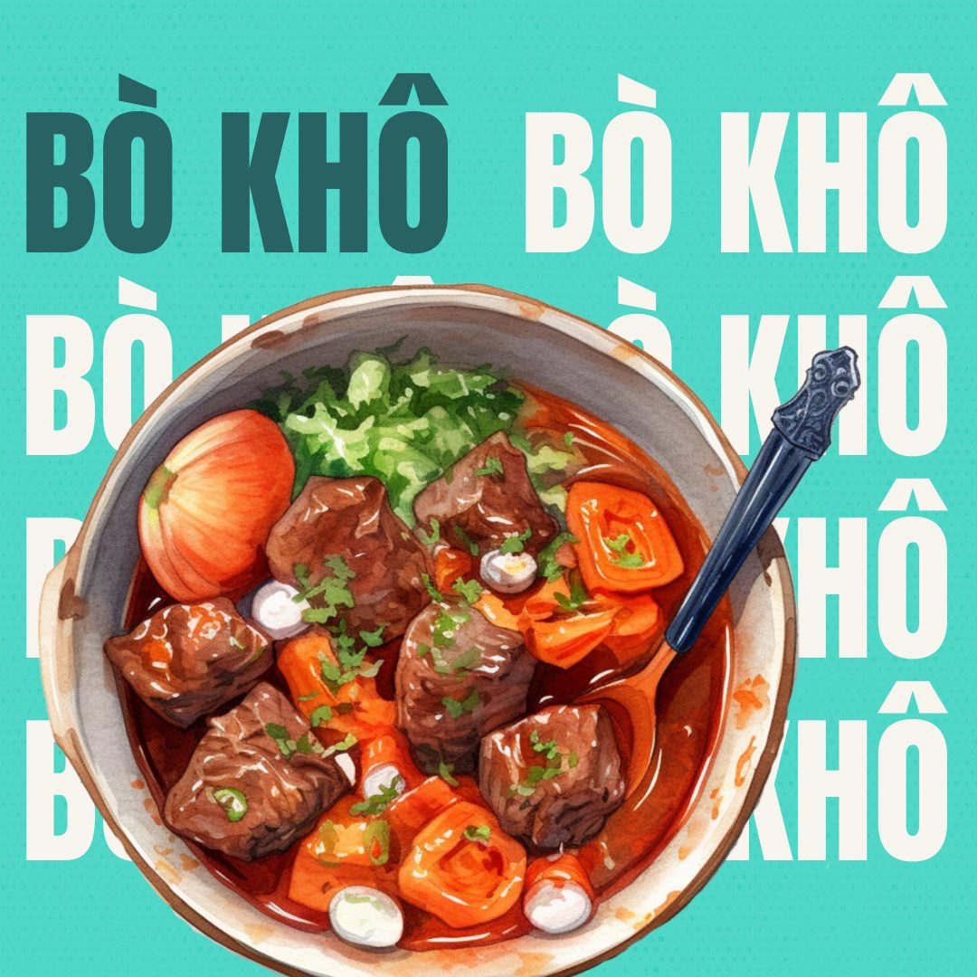
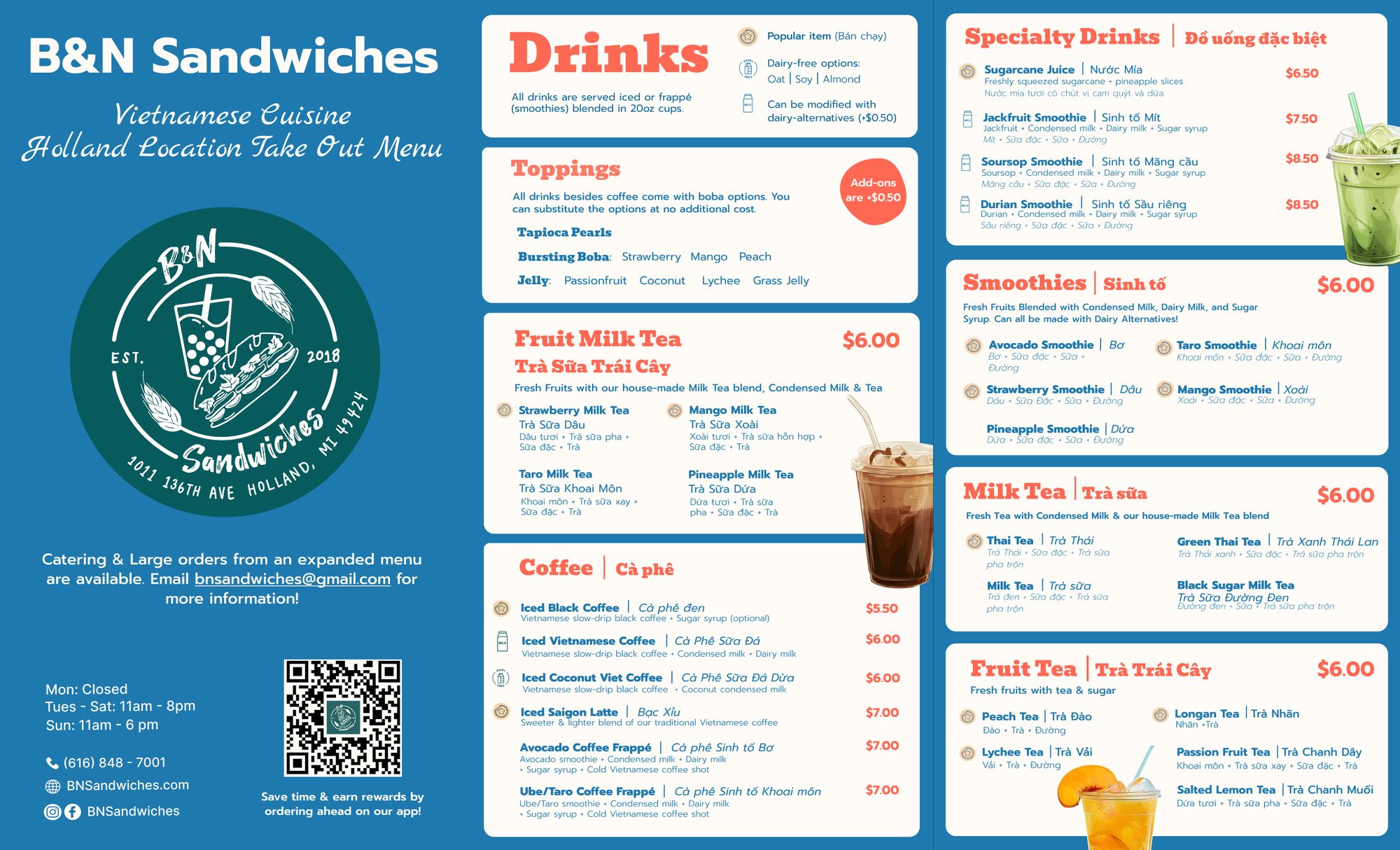
Working alongside one other designer, I helped build every customer-facing touchpoint: the logo system, bilingual print menus, digital TV menu boards, opening day posters, social media food posts, business cards with a loyalty stamp program, and a takeout menu. The goal was to feel energetic, warm, and authentically Vietnamese-American.
300+
Customers opening weekend
2
Languages across every piece
10+
Distinct deliverables for launch
Logo system
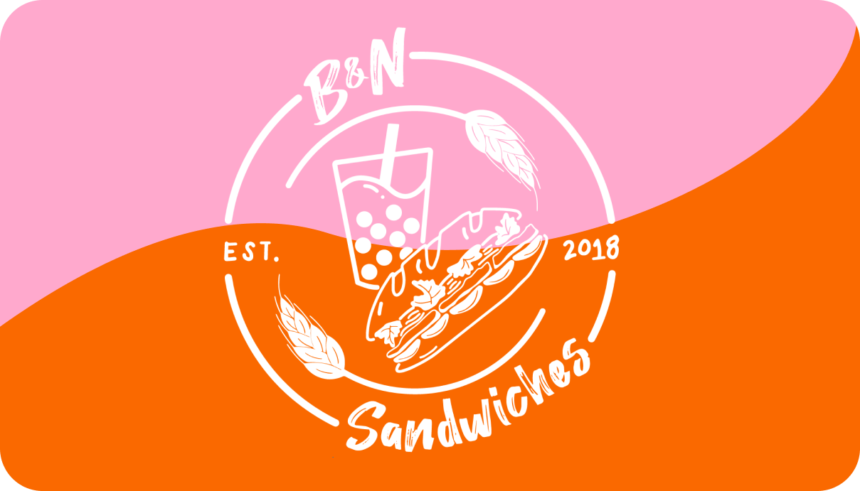
The B&N logo is a hand-lettered circular mark featuring a bánh mì, a boba drink, and wheat stalks, capturing both sides of the restaurant in one image. For the soft opening campaign, the logo shifted to match each graphic's color scheme, keeping the system cohesive without being rigid.
Opening campaign
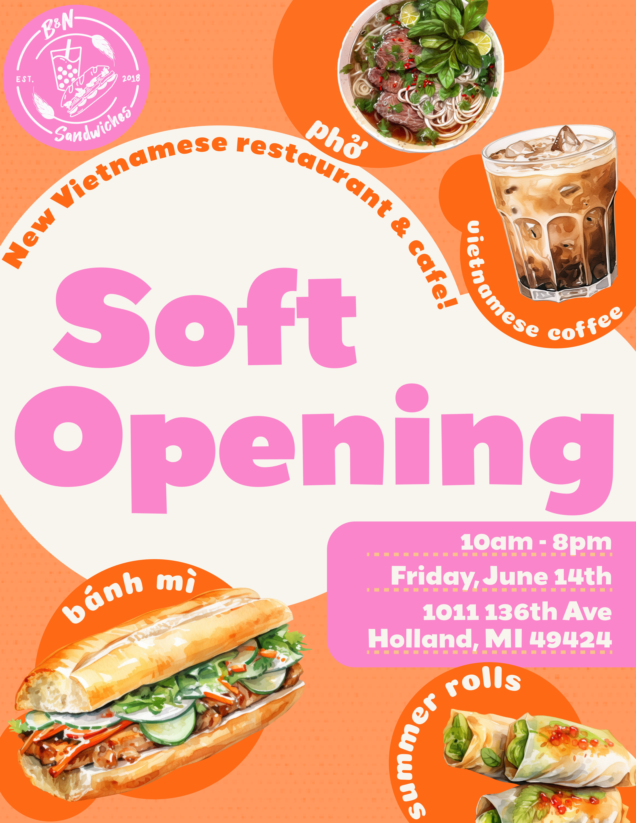
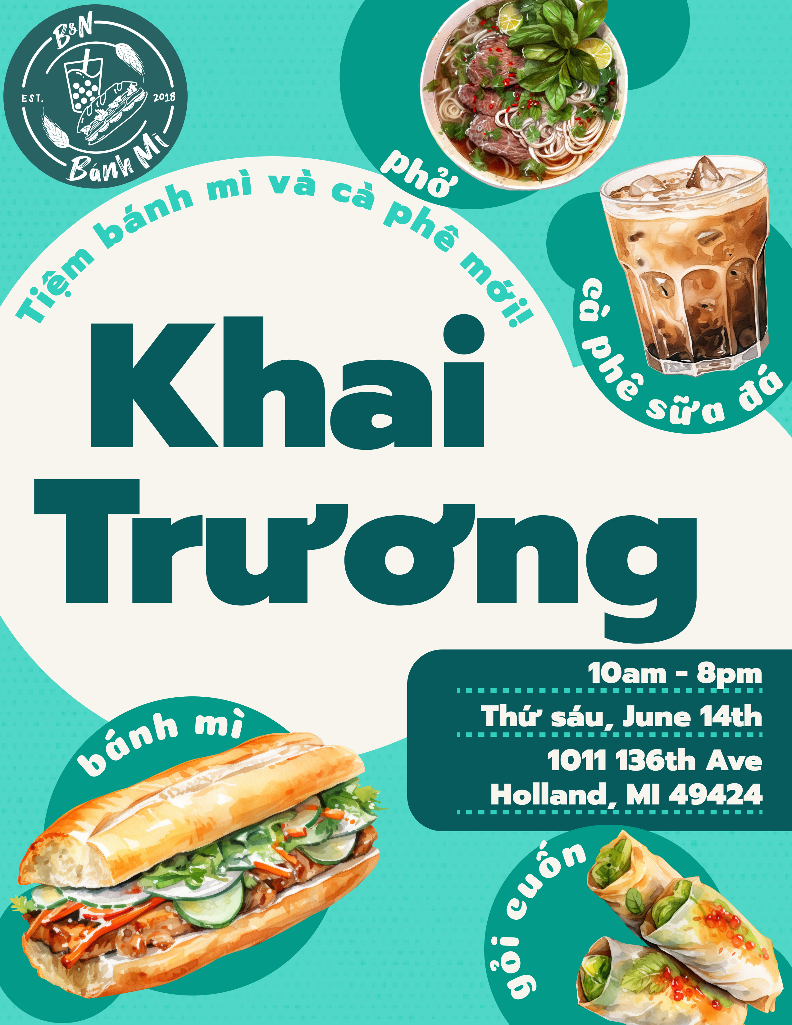
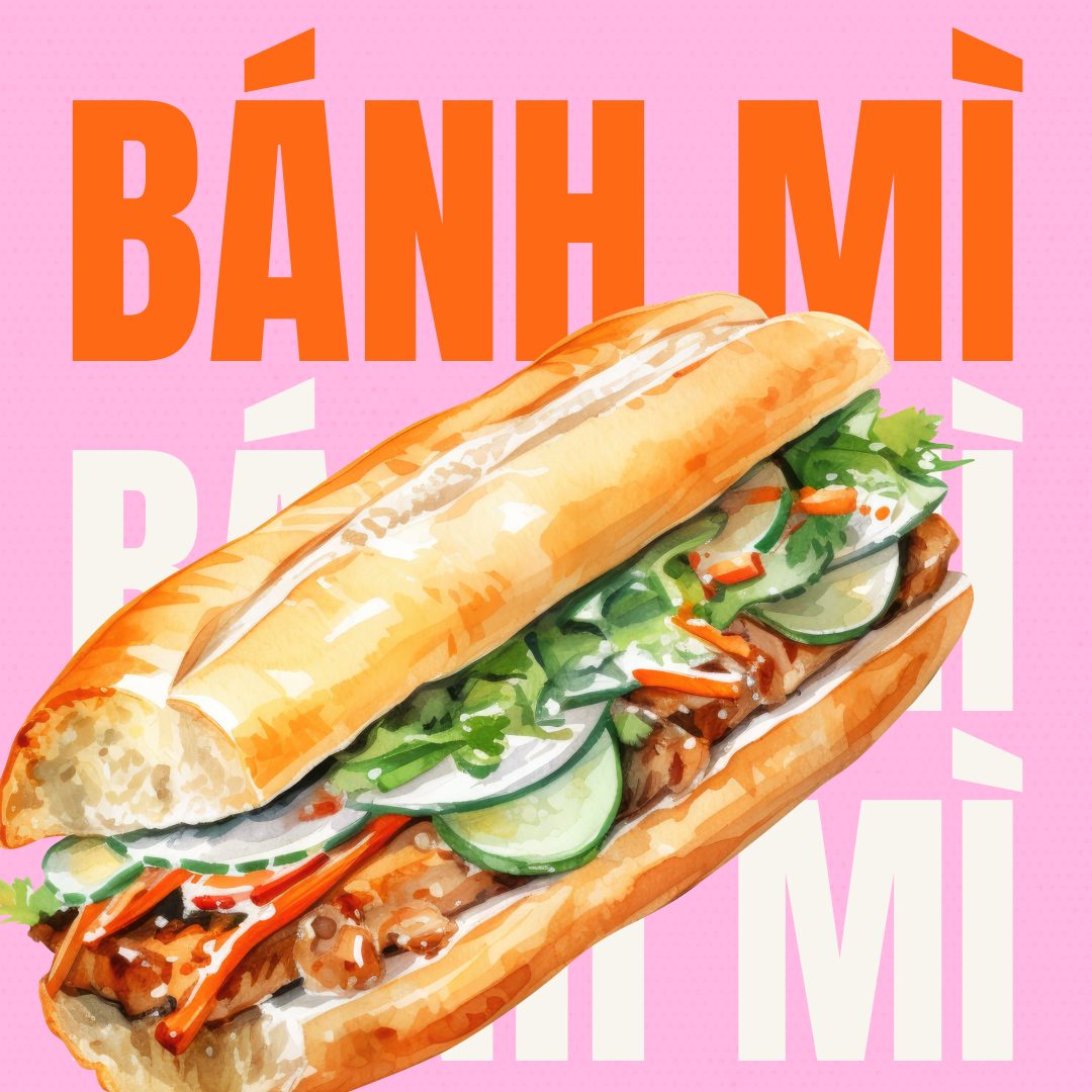
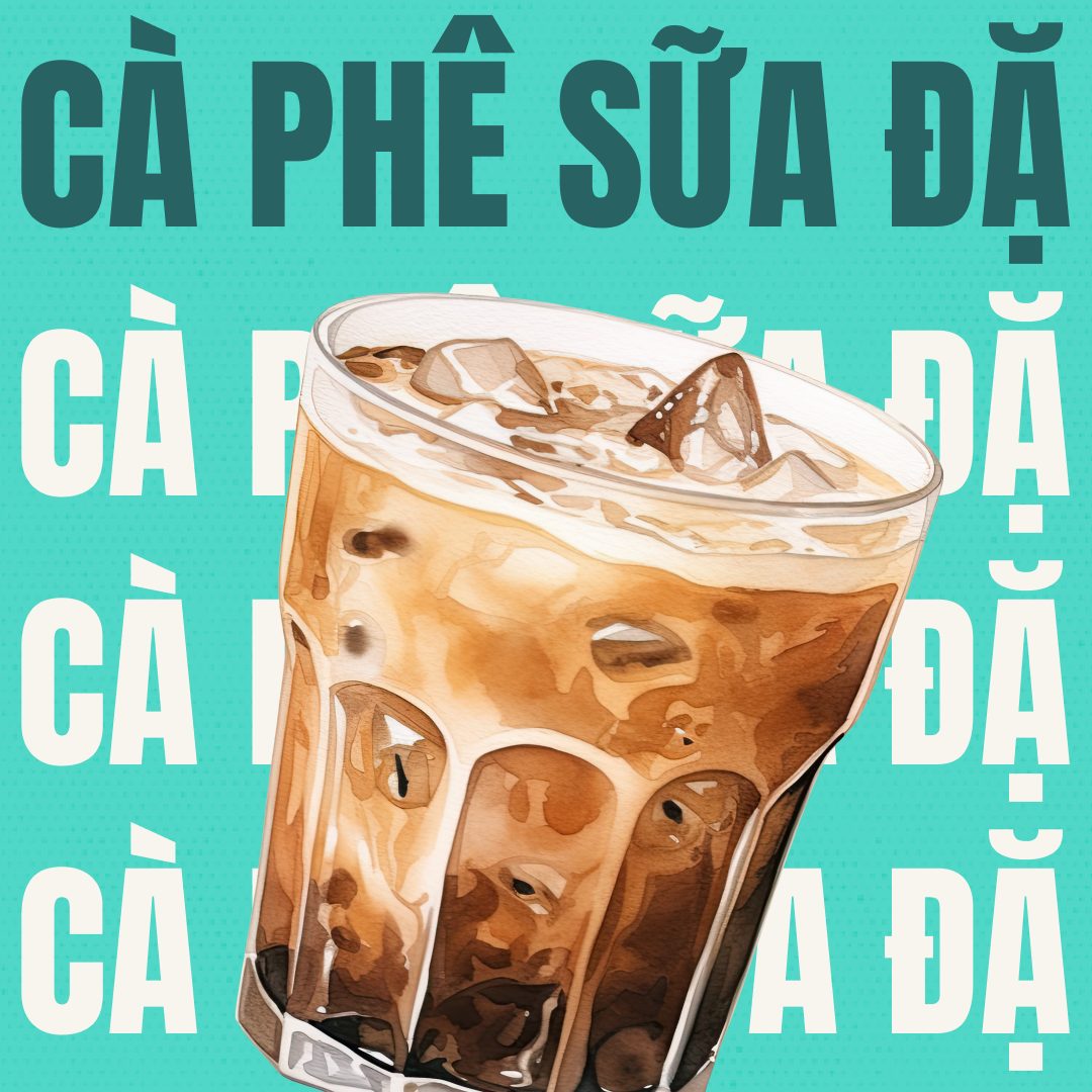
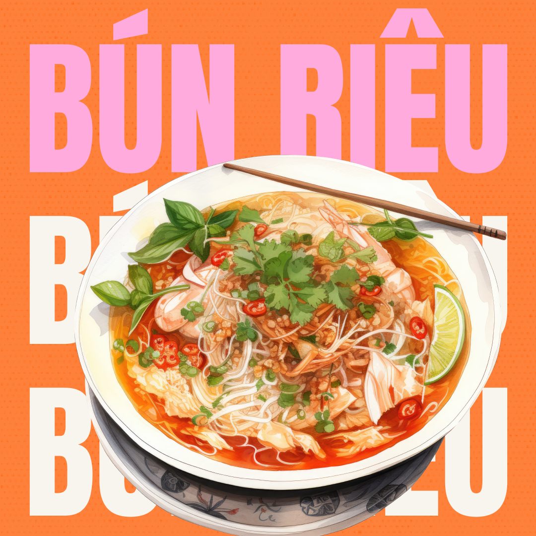
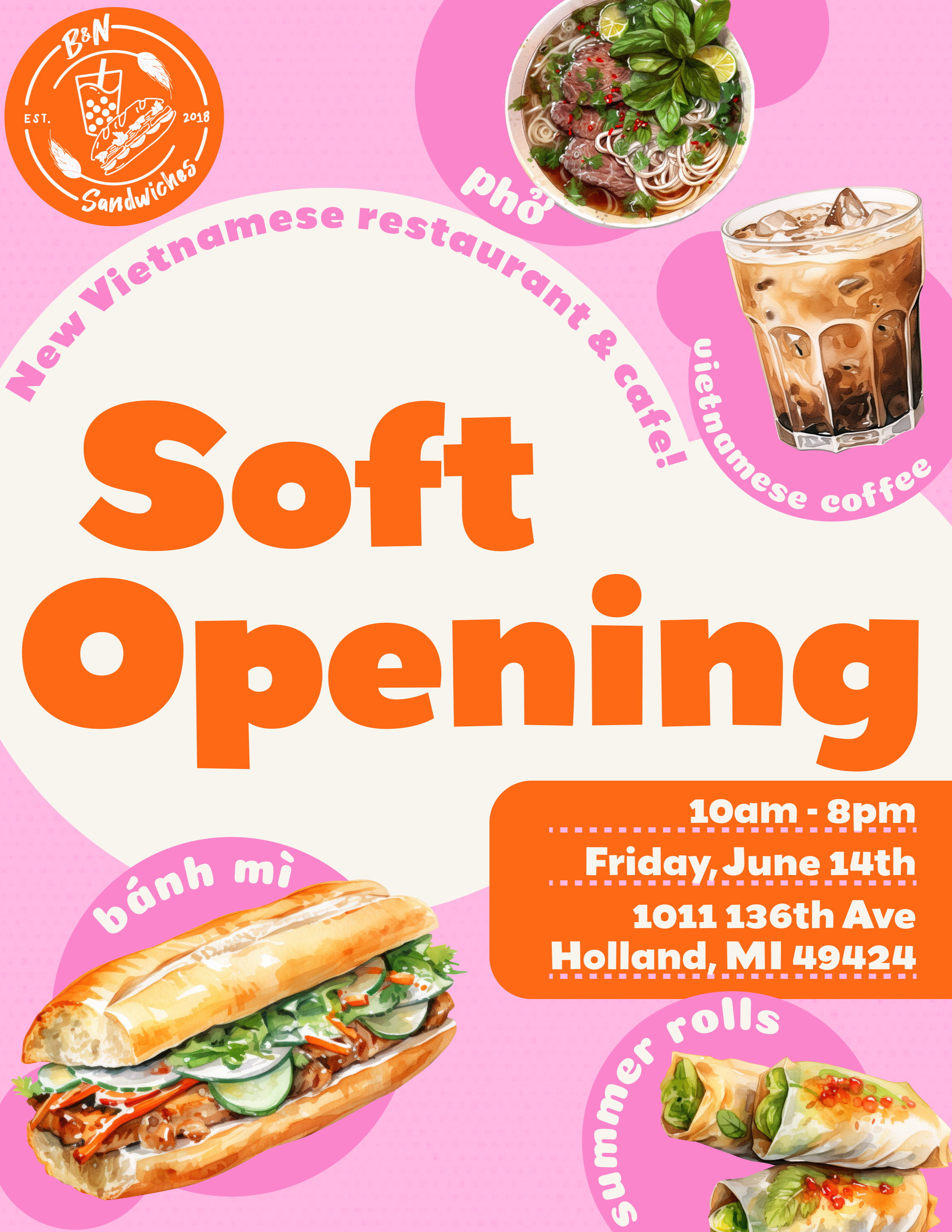
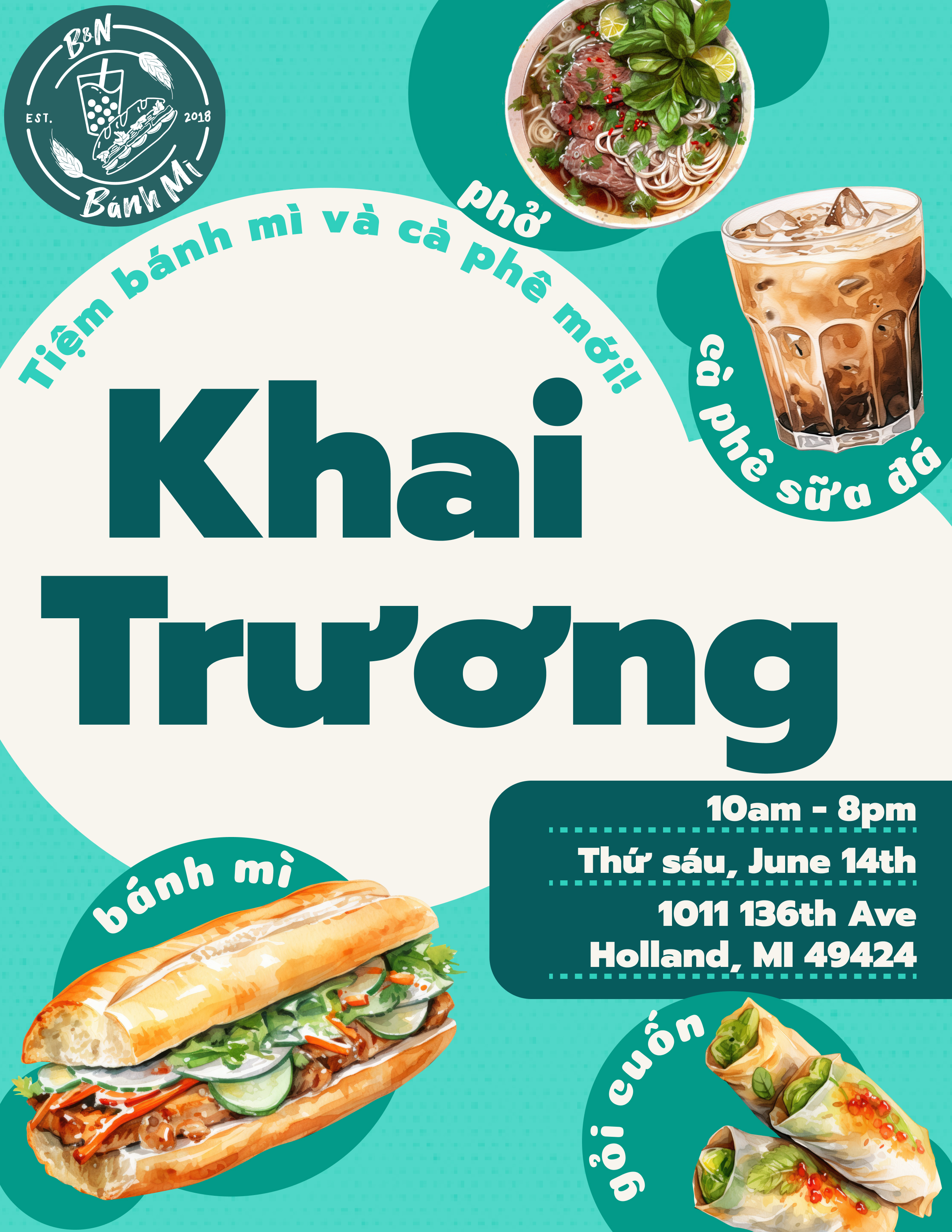
For the June 14th soft opening, I designed a poster system that worked in English and Vietnamese. It had the same bold typographic layout, food illustration collage, and bubble design, adapted for two audiences. Several colorway combinations were explored so the client could choose what felt right for their neighborhood and social channels.
Menus
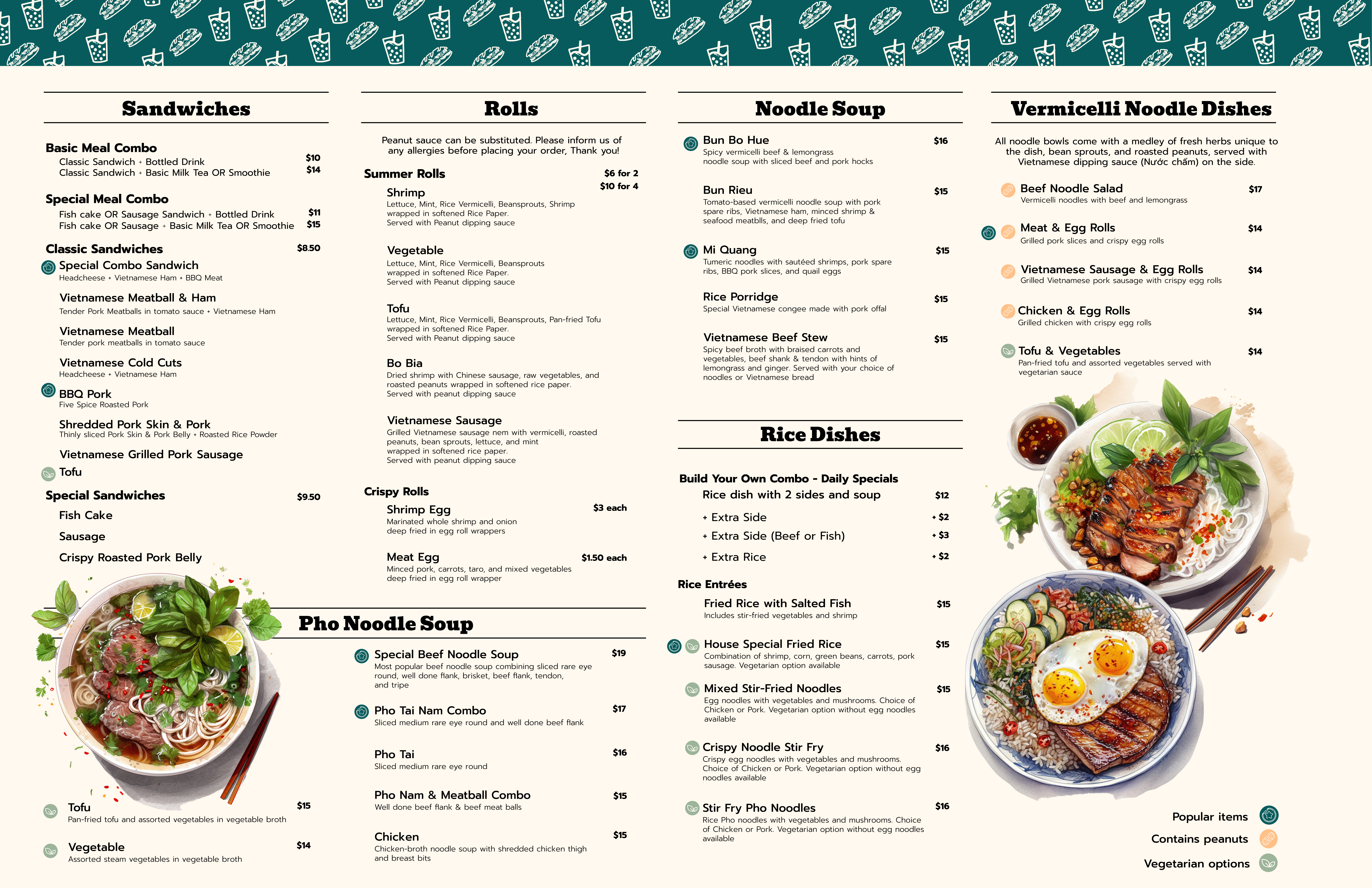
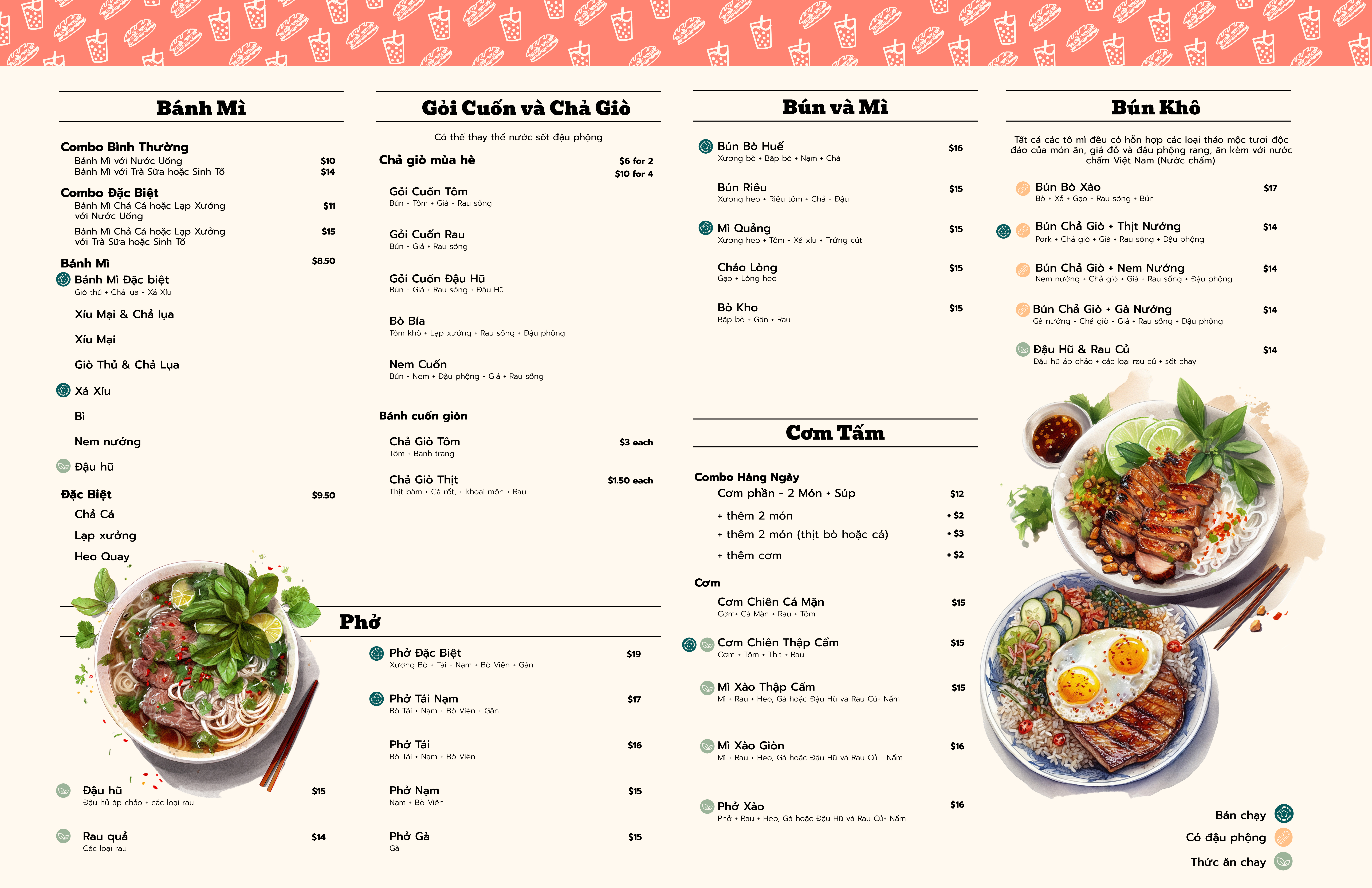
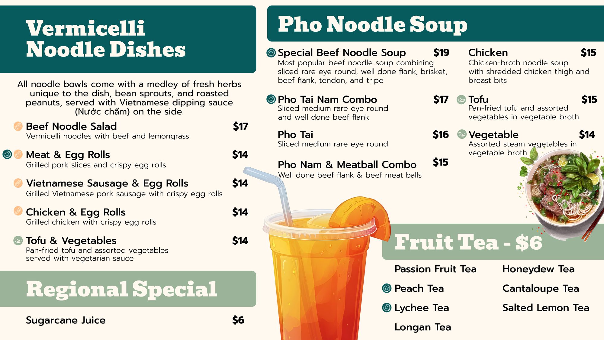
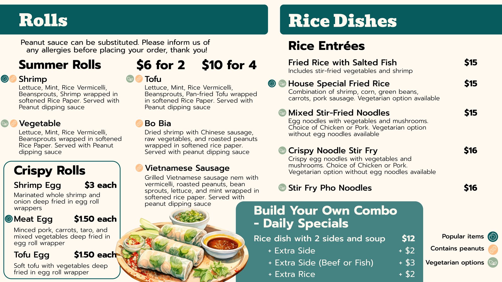
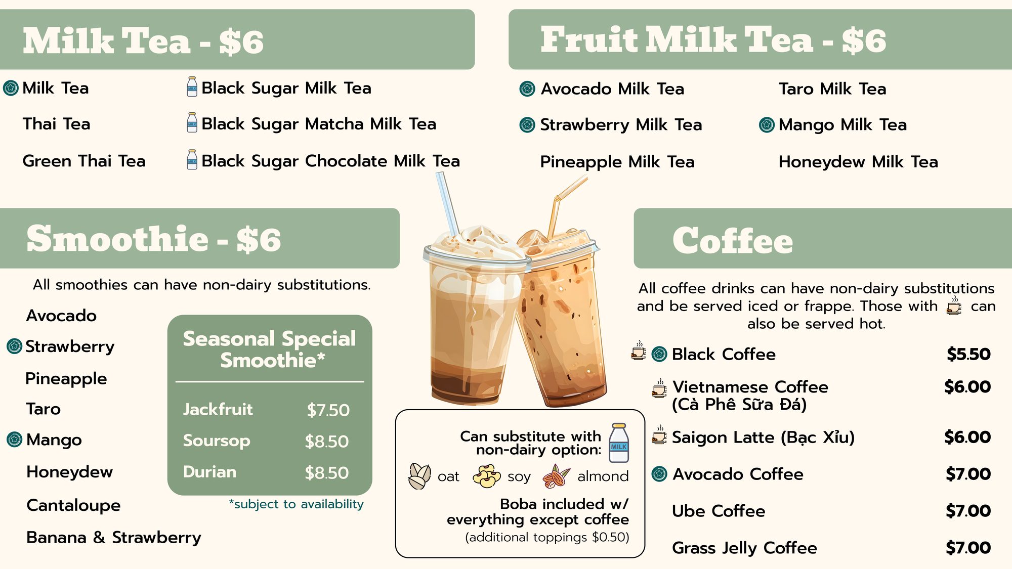
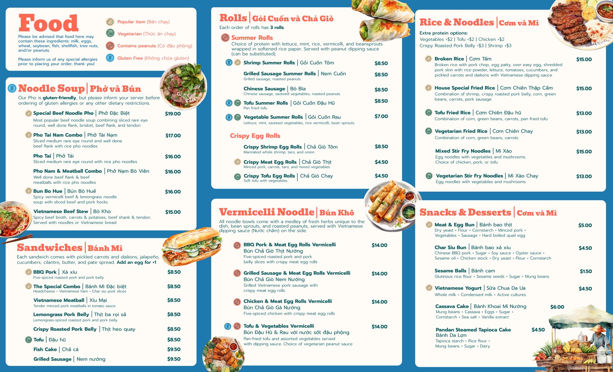
Every menu was designed in both English and Vietnamese side by side. The 11×17 dine-in menus use a coral header stripe for Vietnamese and teal for English, both with the brand icon pattern and watercolor-style food illustrations. The TV menu boards are shown across four screens in the restaurant and use the teal palette for legibility at distance. The takeout menu folds down to a slim portable format.
Collateral
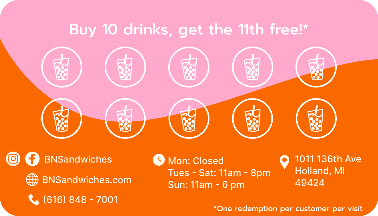
The business card doubles as a loyalty stamp card on the back, a detail that encouraged repeat visits from day one. The front uses a pink/orange wave split with the logo centered across it. The takeout menu is a bilingual portrait format printed on a slim tri-fold, giving customers everything they need to order ahead.